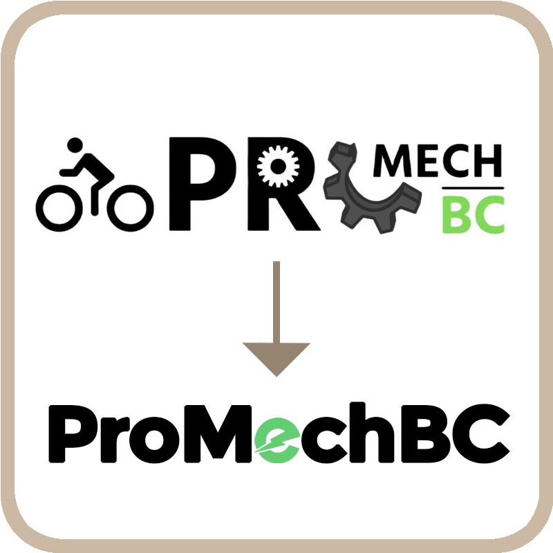
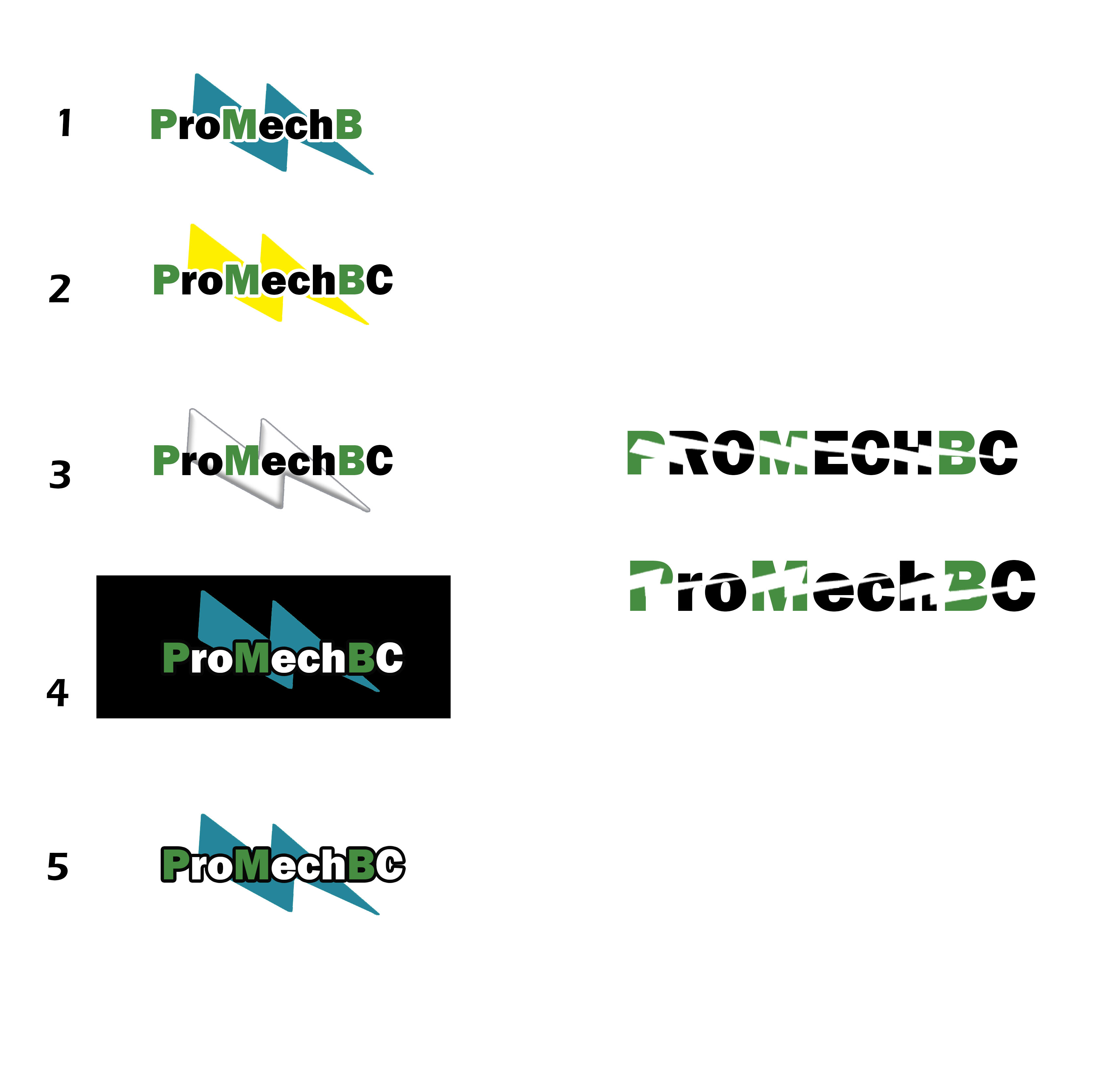
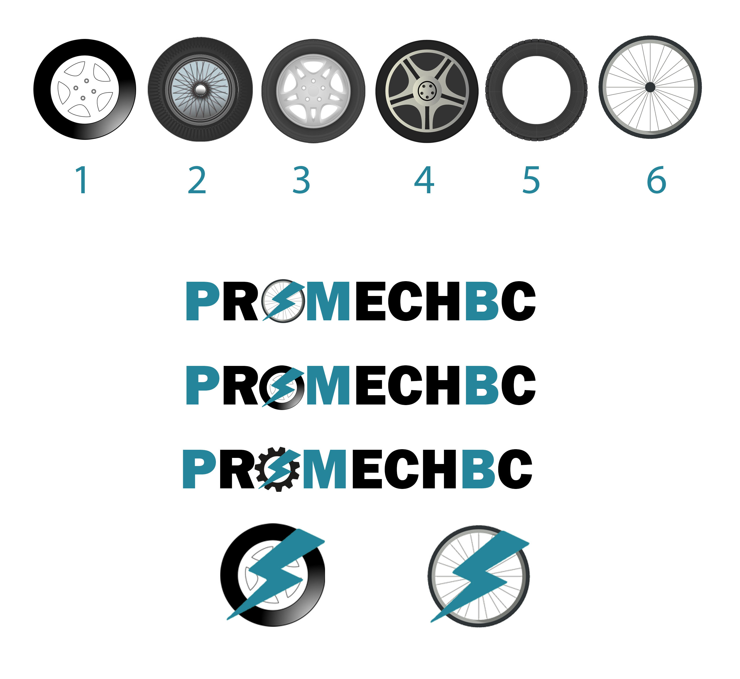
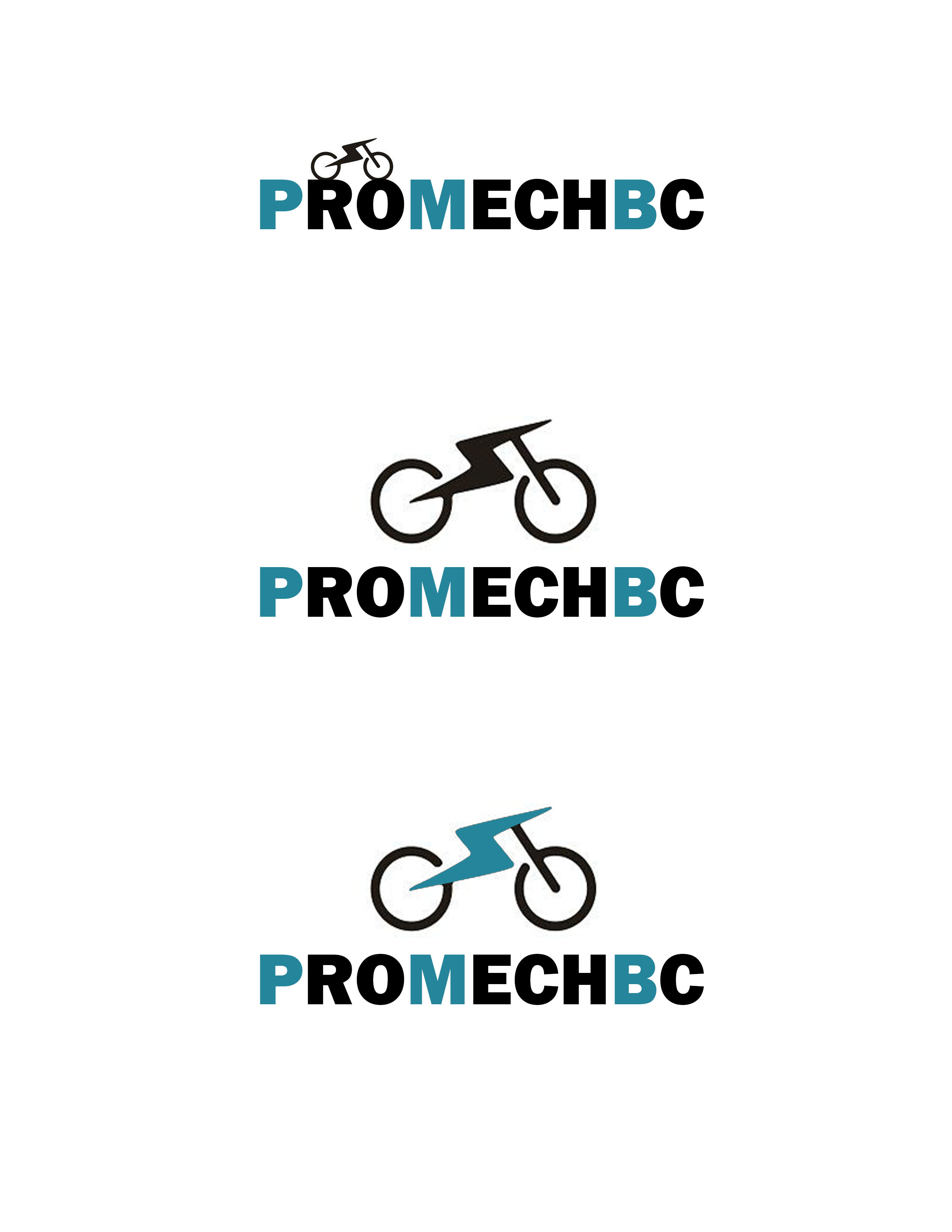
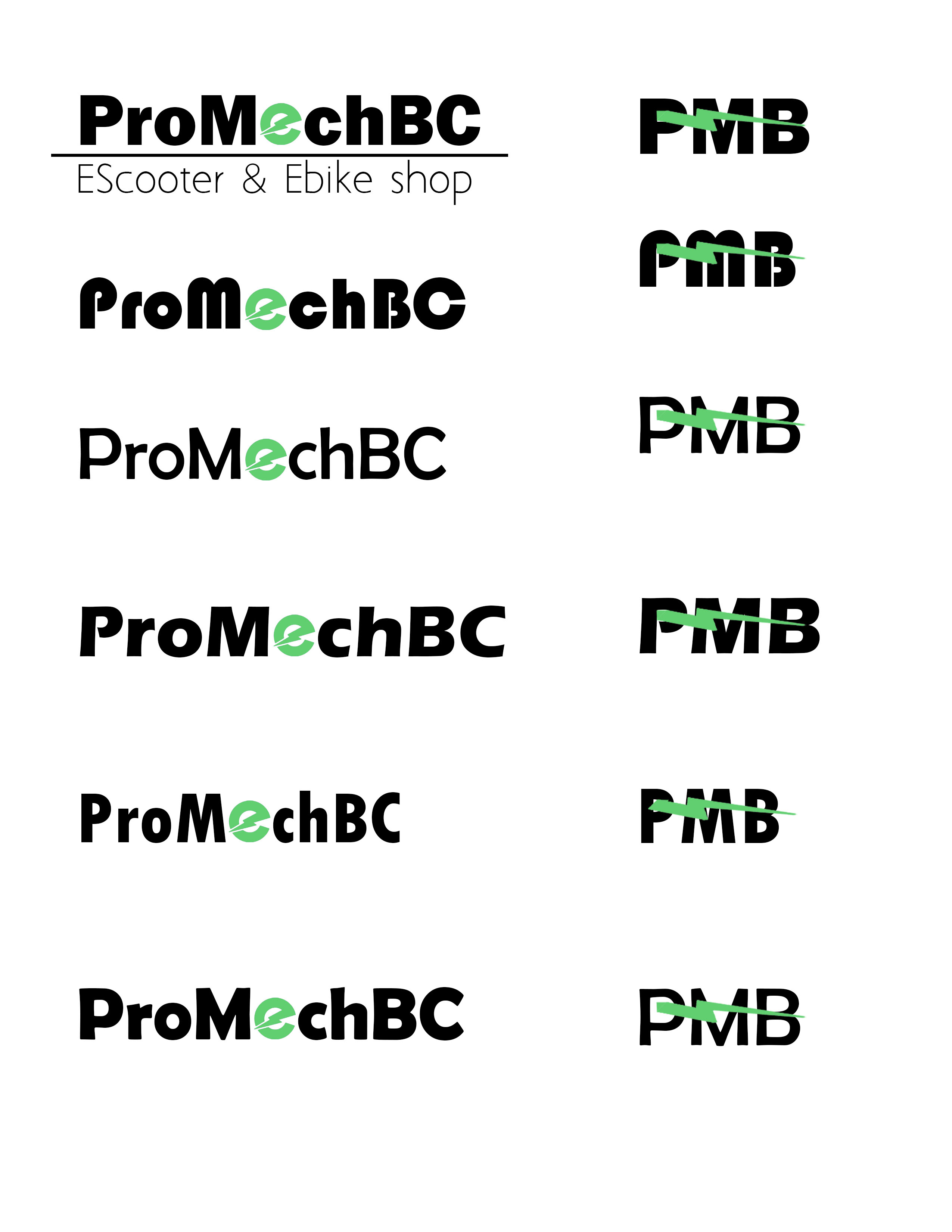
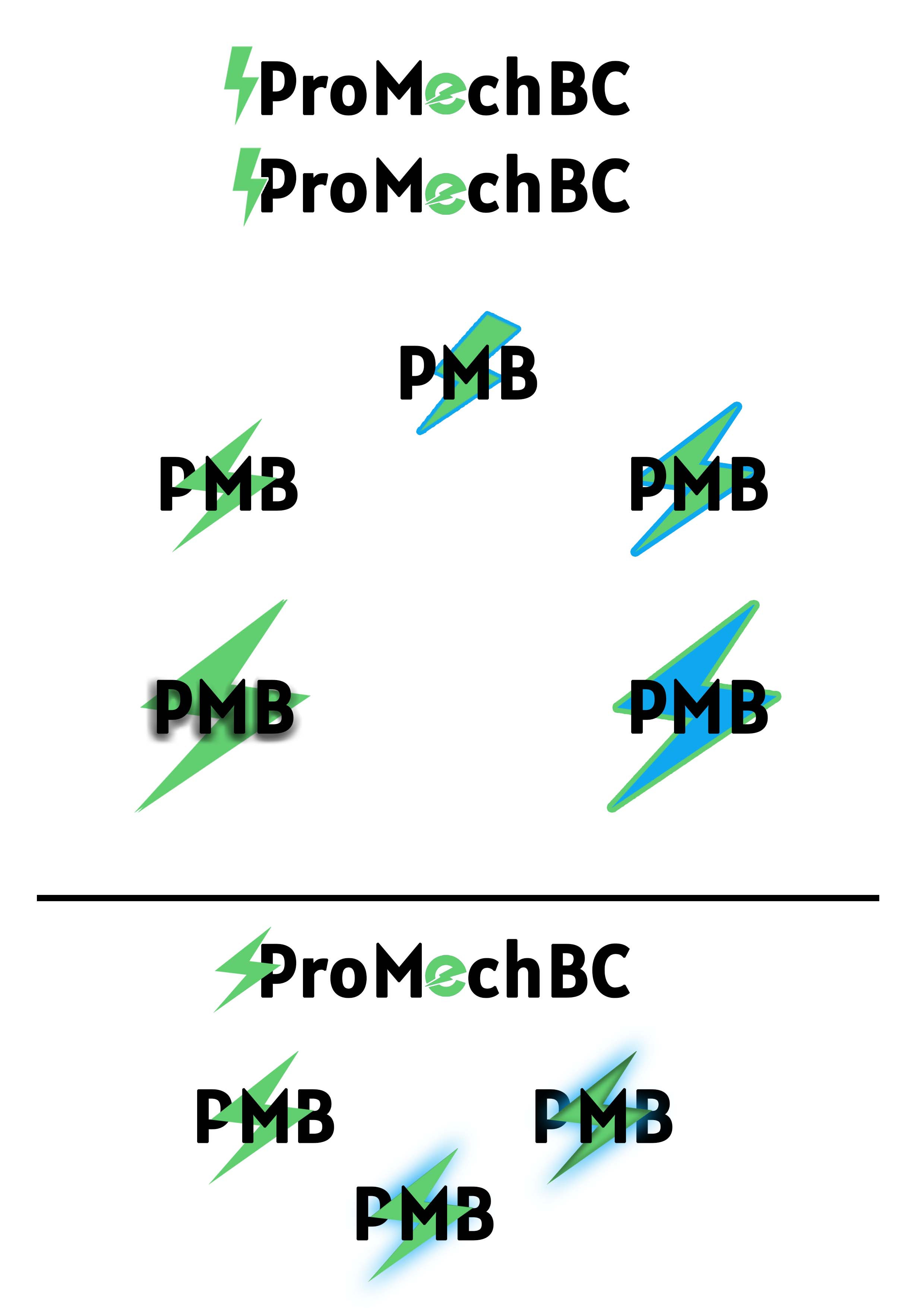
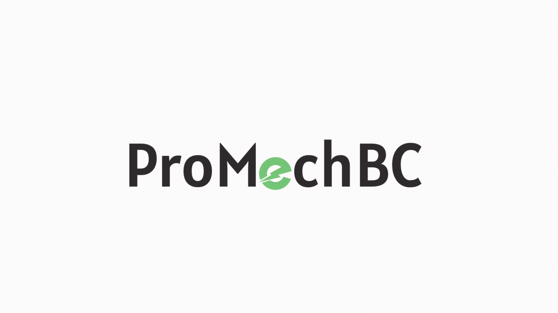
ProMechBC
For this branding and logo redesign project, I transformed the previous ProMechBC logo into a more modern and cohesive identity. The original logo had multiple elements representing different mechanical components, but I refined it into a cleaner and more professional design that better reflects the company’s focus on electric bicycles. In the new logo, the letter “E” is designed as a rotating bicycle wheel, symbolizing motion and sustainability while reinforcing the brand’s connection to electric mobility. This redesign enhances brand recognition and provides a more polished, contemporary look for ProMechBC.


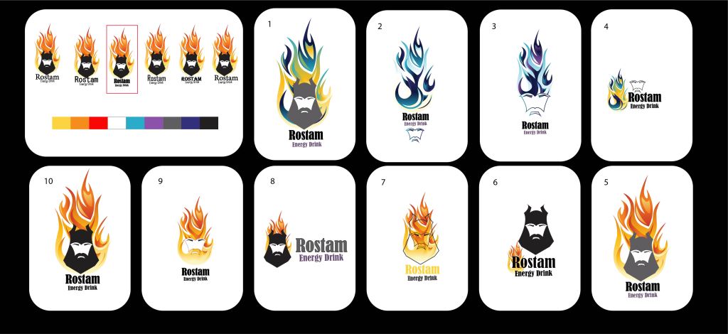
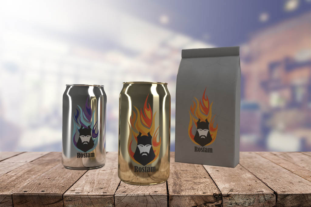
ROSTAM-ENERGY DRINK
WEBSITE AND BRAND DESIGN
This unique project involves creating a website and brand book for an energy drink named after a Persian hero, Rostam. The branding will aim to capture the essence of Rostam’s heroic qualities and convey them through a cohesive design that highlights the energy and power of the drink.