

Canada Green Insulation Inc.
Website Redesign & UX/UI Enhancement
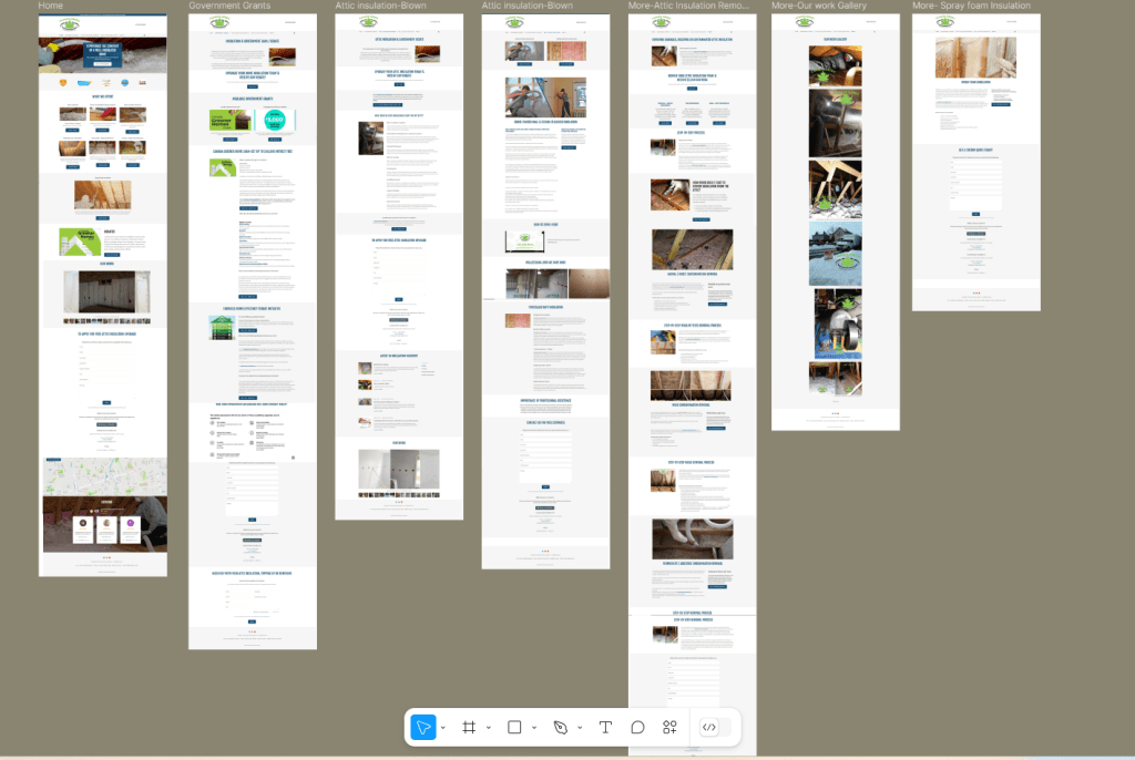
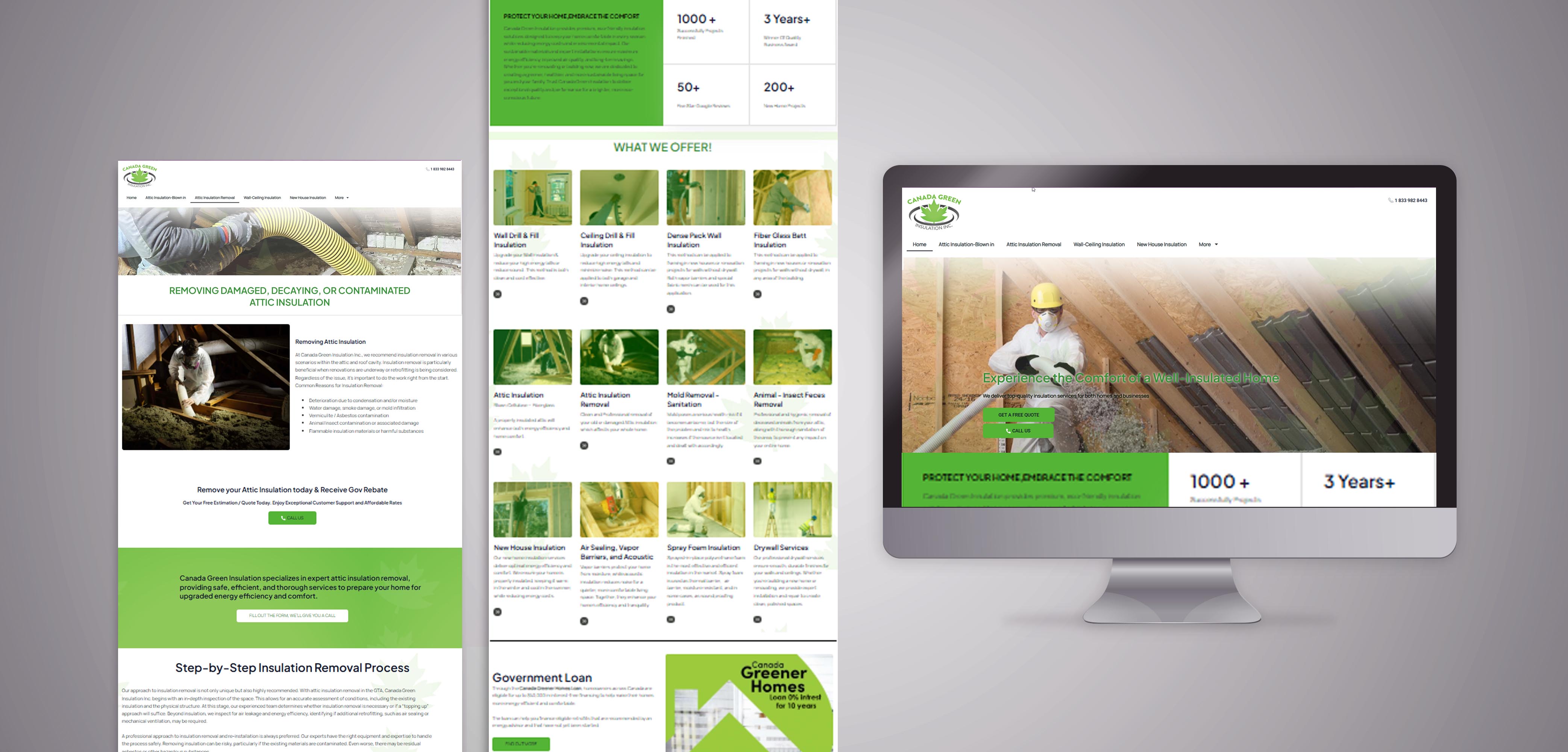
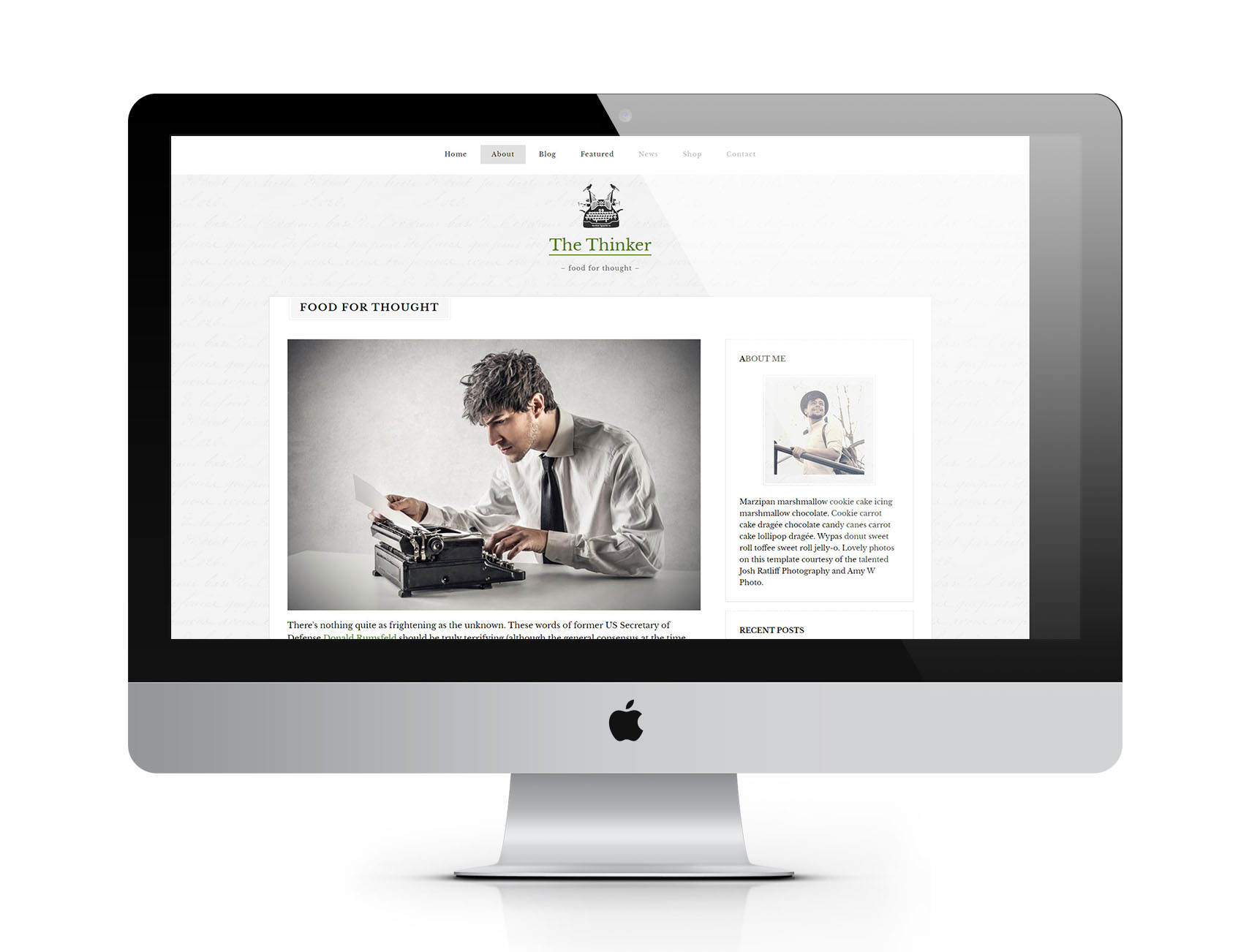
I conducted a comprehensive UI/UX analysis of the previous website and implemented a complete redesign to enhance its aesthetics, functionality, and user experience. Utilizing WordPress with Elementor, I structured a modern and intuitive layout, improving navigation and accessibility. Additionally, I customized several sections using code to ensure optimal performance and a seamless user journey. The redesigned website, Canada Green Insulation, now offers a more engaging and user-friendly experience, reflecting the brand’s identity while maintaining responsiveness across all devices.
Content Optimization & User Flow Enhancement
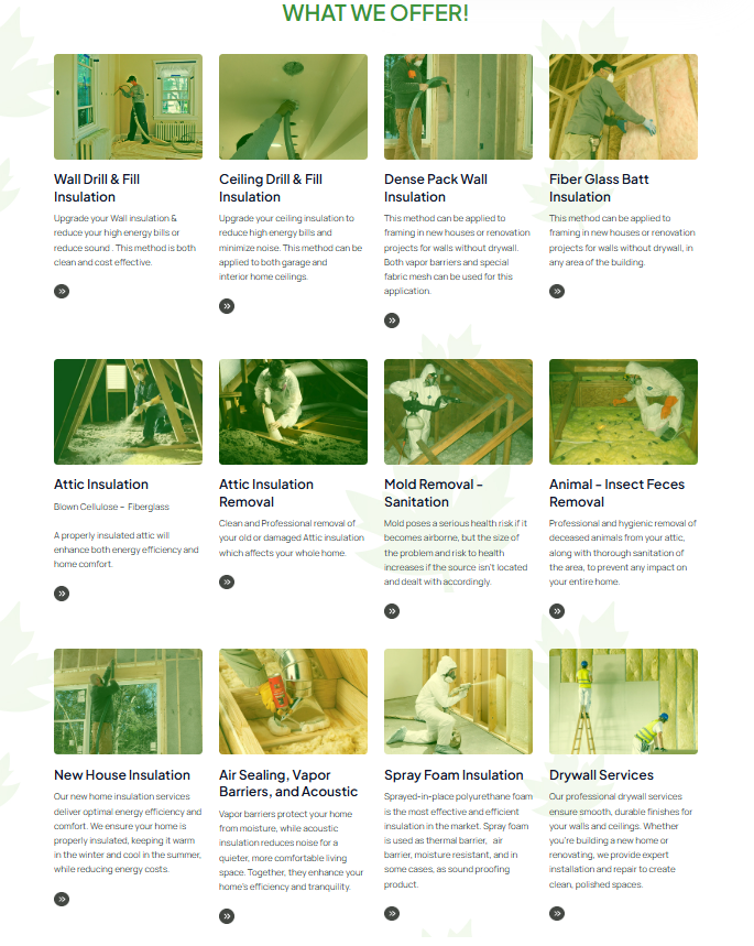
As part of the redesign, I added new pages and sections featuring detailed explanations, images, and videos to provide visitors with clear and engaging information. I streamlined the user journey by removing unnecessary buttons and redundant forms, ensuring a more intuitive browsing experience. The revised structure now guides users seamlessly to the information they need while making the inquiry process more efficient. By optimizing content presentation and enhancing navigation, the website delivers a more user-friendly experience, encouraging higher engagement and easier access to essential details.
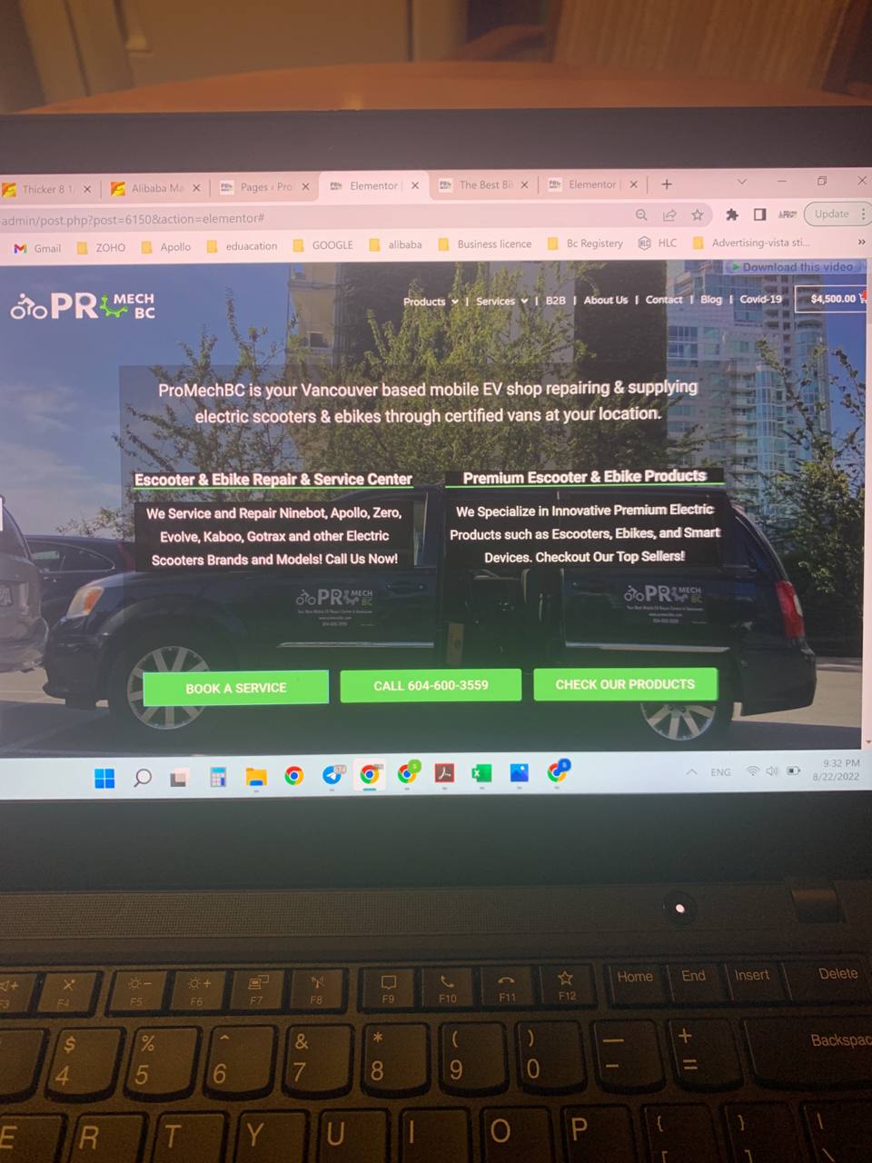
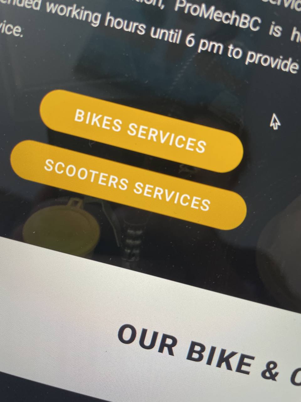
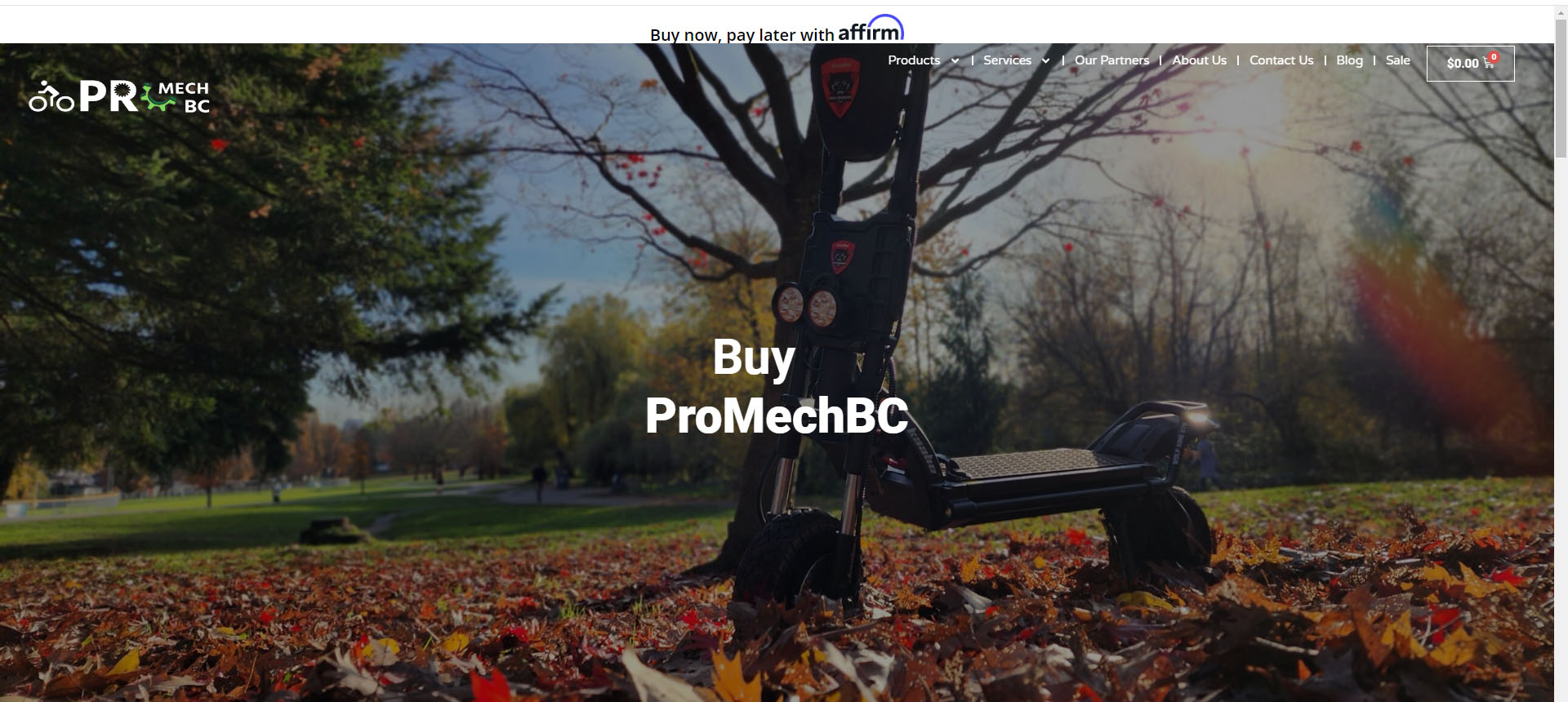
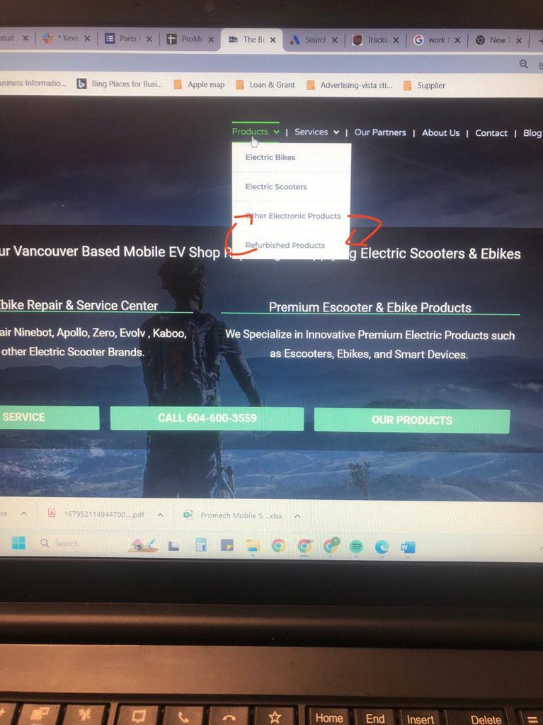
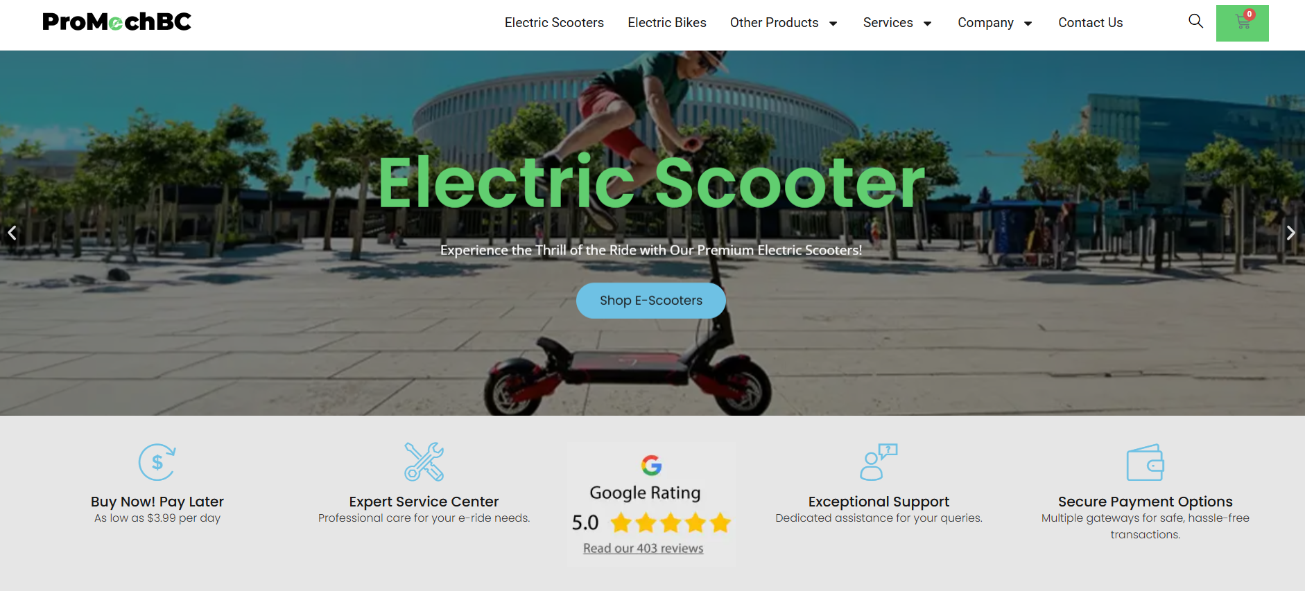
ProMechBC
Comprehensive UI/UX Redesign and Brand Enhancement
In this project, I began with a brand design update, refining the company’s logo to improve clarity and visual impact. By analyzing competitors’ websites, I provided strategic UI/UX recommendations, including unifying button styles for consistency, removing excessive text that overwhelmed visitors, and streamlining the overall layout.
Additionally, I developed a cohesive UI design strategy for two interconnected websites by implementing a mini design system, ensuring consistency in shared products, and optimizing state buttons and interactions for a seamless user experience. Through close collaboration with the team, we transformed the website into a modern, user-friendly platform that effectively meets stakeholder requirements.


User-Friendly Redesign
Take a quick look at how the website has transformed into a more intuitive and user-friendly experience. With a cleaner layout, improved navigation, and a cohesive design, visitors can now find what they need effortlessly.
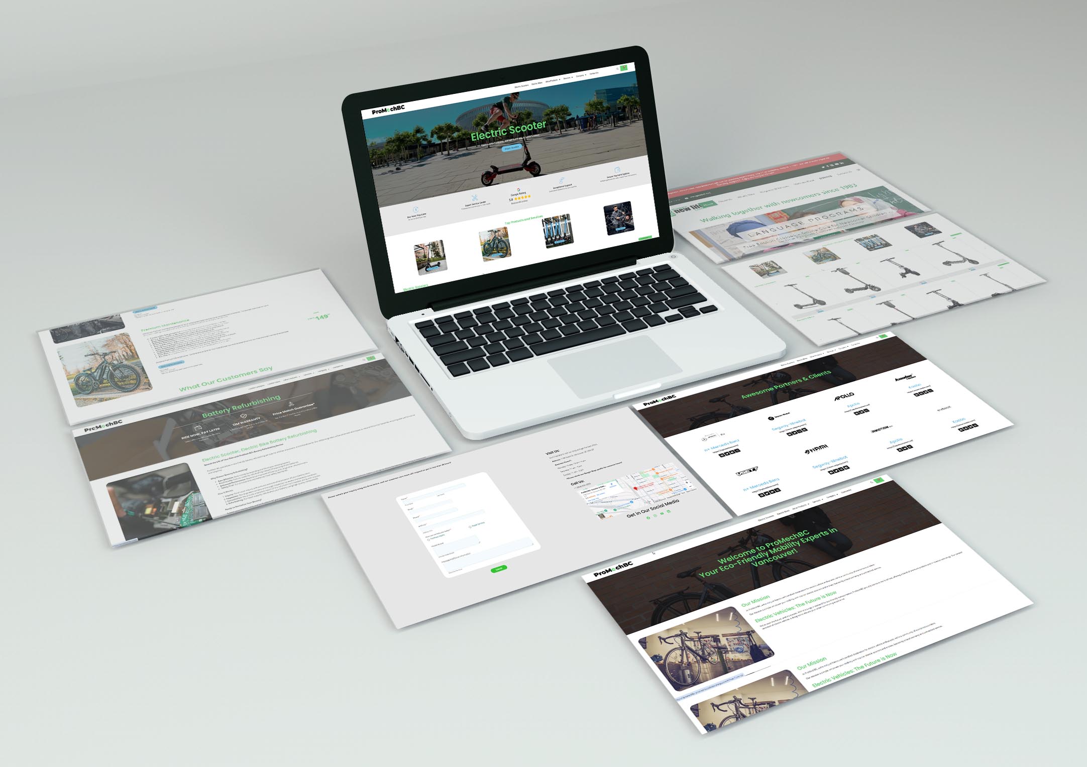
This redesign brings a cleaner, more structured layout that enhances usability and accessibility. With intuitive navigation and a modern design, users can now interact with the website more efficiently..
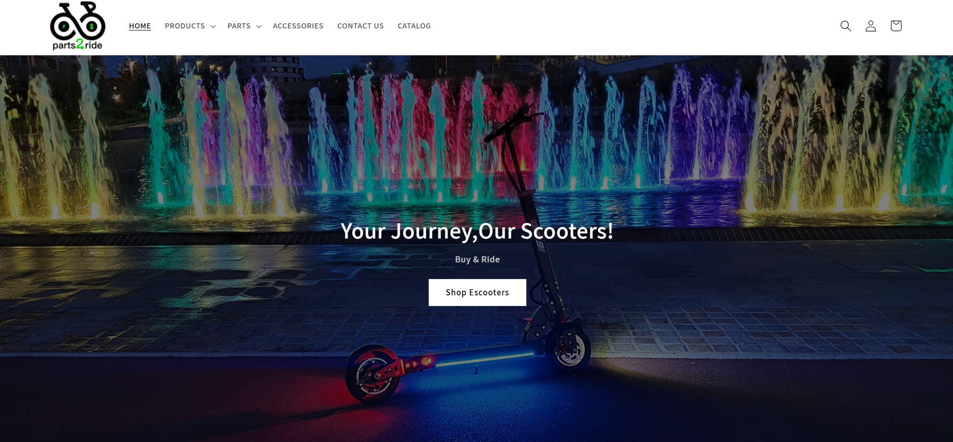
Other Projects
This section showcases a collection of smaller projects built using HTML, CSS, and JavaScript, demonstrating clean and efficient front-end development. These projects incorporate Bootstrap for responsive design, RESTful APIs for dynamic data fetching, and version control through Git. Additionally, they leverage React Router for seamless navigation and React State for efficient data management, ensuring a smooth and interactive user experience. Each project highlights practical implementations of modern web technologies in real-world scenarios.
Website projects designed using HTML and CSS for clean and responsive layouts.

Website projects built using HTML and CSS, designed for various businesses, from flower shops to retail stores.
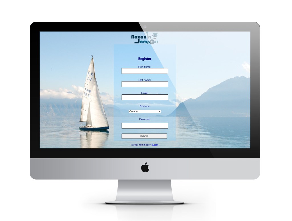
This website design project features a registration form and collects information from customers using HTML and CSS.

This website design project features a registration form and collects information from customers using HTML and CSS.
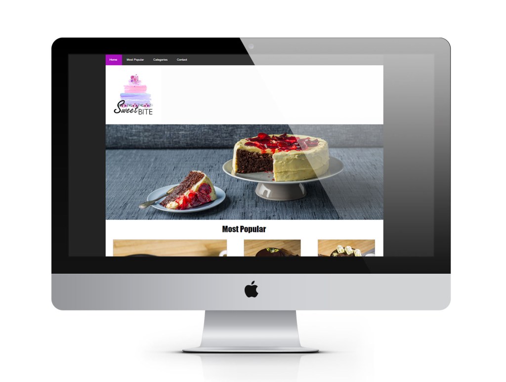
Creative website designs for cake shops, online stores, and photography galleries, crafted for a seamless user experience.
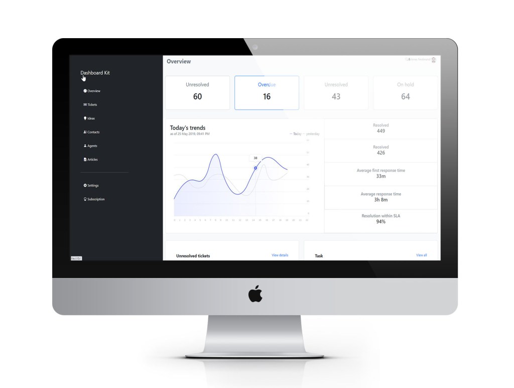
Responsive website design using Bootstrap, featuring interactive charts, dynamic tables, and a well-structured menu for seamless navigation.
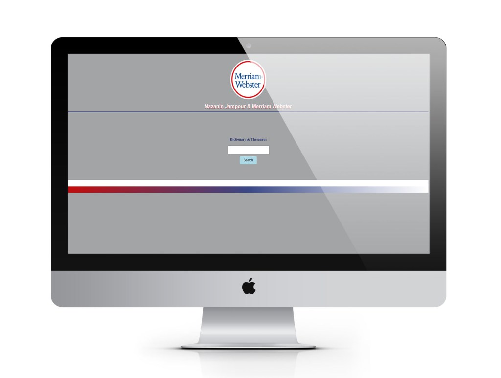
Website design utilizing RESTful APIs to integrate an interactive dictionary for seamless word searches and definitions.

Website design using Bootstrap, featuring interactive dynamic tables, enhanced with icons and visual signs for better usability.
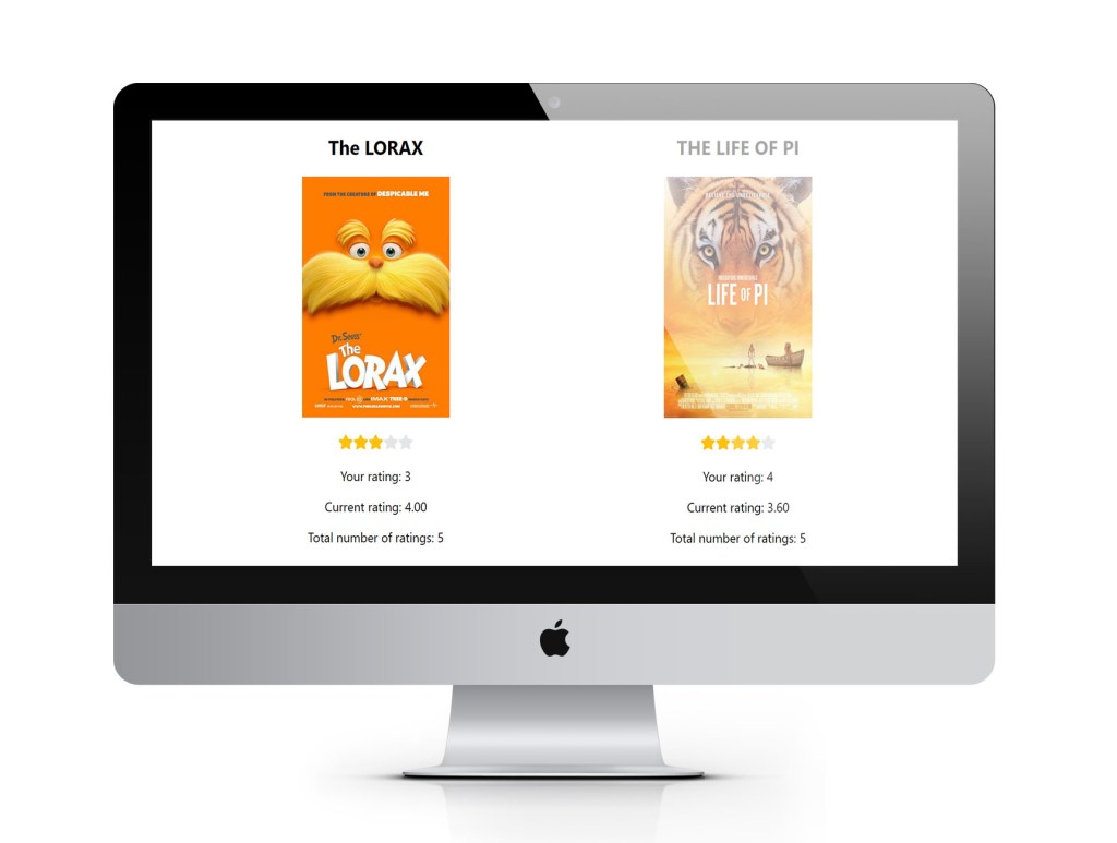
This website project is built using React and utilizes React State to display movie ratings provided by site visitors.
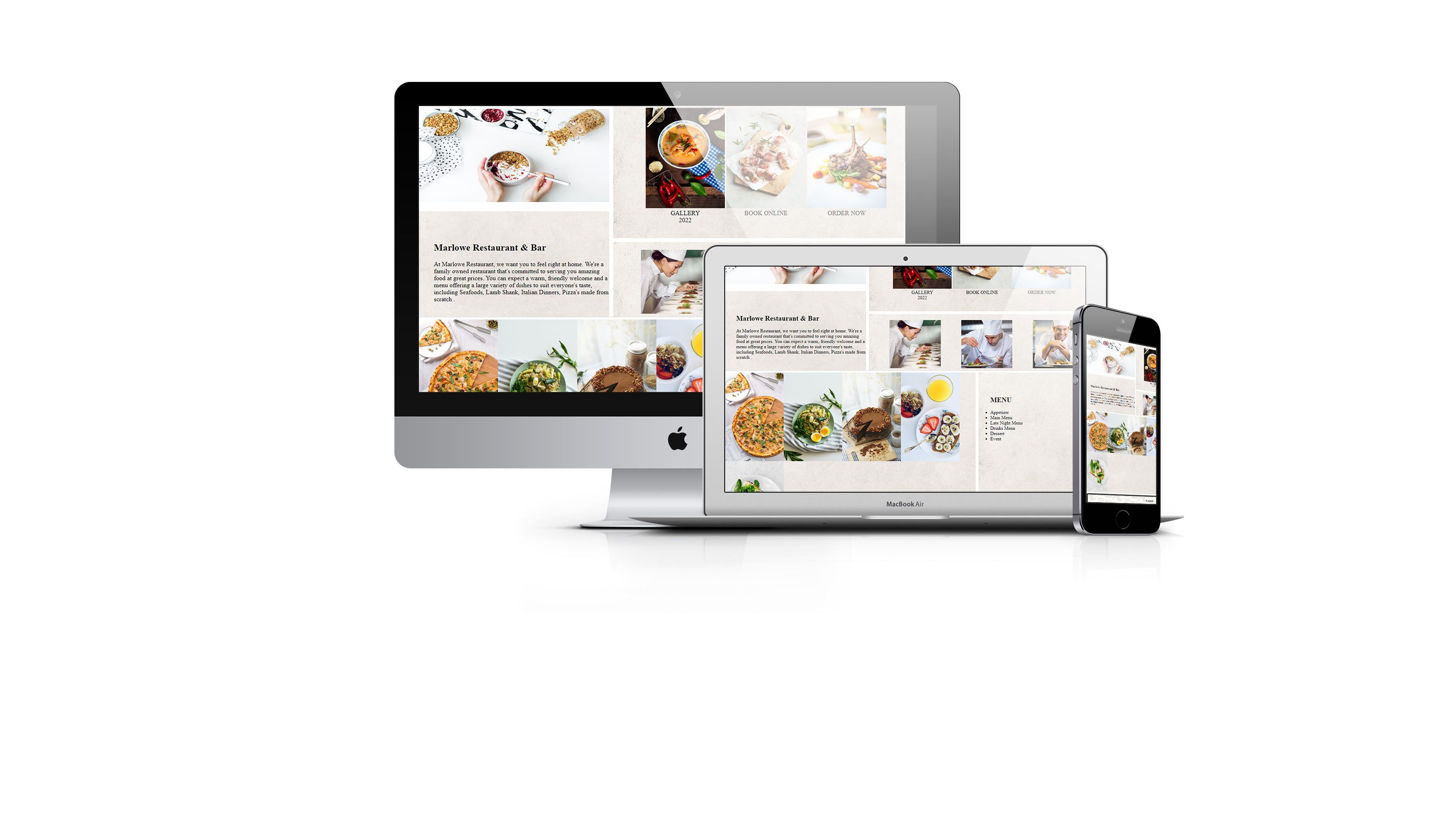
This cooking website is built using HTML, CSS, and JavaScript, featuring a fully responsive design with a gallery of images and a structured layout for recipes. The images and content maintain their order and alignment when adapting to different screen sizes, ensuring a consistent grid and column structure across desktop, tablet, and mobile views.
 Nazanin Jampour